Best Practices Breakdown: Prioritization
Welcome to the first post in a new series focusing on the best practices of content creation. We know how hard you work and that creating the best quality content can be time consuming, so we want to make it a little easier for you! This time, we will focus on prioritization or the arrangement […]
Daktronics Commercial Software Training on 9/27/2017
Categories: Venus Control Suite Training

Welcome to the first post in a new series focusing on the best practices of content creation. We know how hard you work and that creating the best quality content can be time consuming, so we want to make it a little easier for you! This time, we will focus on prioritization or the arrangement of elements in your messages.
Remember . . . less is more!
We recommend keeping your messages as brief as possible, using only two or three elements. An element could be anything from a text box, graphics/images, animations/videos, data including time, temperature and date messages, to a scrolling text message. To put it simply, elements are all the components that make up your presentation.
Under 2 seconds
We create our content to convey the key message in under 2 seconds. We support the Federal Highway Administration guideline stating that drivers not take their eyes from the road for more than 2 seconds. We can accomplish this goal by creating content that uses a really strong graphic and very concise text.
Trainer Tip: Based on what we’ve been talking about, we recommend setting your default layout/slide time to 3 seconds. You can adjust this setting accordingly by reading the following Knowledge Base articles.
- How do I adjust the hold time or duration of slides in the Venus Control Suite Web Compositor?
- How do I adjust the hold or duration of layouts in Content Studio?
Although your display does have the capability of showing messages for longer, the most effective messages can be understood in 2-3 seconds. What this really means is that you only have 2-3 seconds to tell a story! We can achieve this by creating presentations that are BRIEF, BOLD, and LEGIBLE.
Prioritization
Therefore, the most important principle for creating effective content is visual prioritization of the message, or the composition of your presentation. To communicate effectively with your potential customers, prioritize each element in order of its importance to your message. The more distinct an element is, or the more it stands out, the faster people will comprehend it.
Content creation rules
Let’s look at a few different examples to give you an idea of how to approach content creation from this perspective. We are first going to establish a few rules to follow, just to help keep us honest!
- Focus on a single idea to attract a viewer’s attention, then move them through your message.
- Keep your messages short. Too much text on a display is difficult and time consuming to read.
- Make sure your messages are simple and easy to retain by keeping them brief, bold and legible.
Practice makes perfect. Let’s get started!
Practice Example 1:
Ineffective – Too much text makes this message ineffective. The text is too small and squished together just to fit on the display. Not only would people not be able to read it because of the size, they also wouldn’t have time to finish the entire message while passing by.
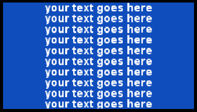
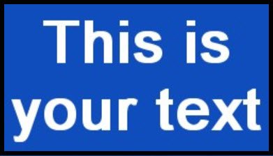
Effective – This message is effective because the message is brief, and the font size is large enough to fill up the entire display. Passersby will be able to clearly see the text and have plenty of time to read it.
Practice Example 2:
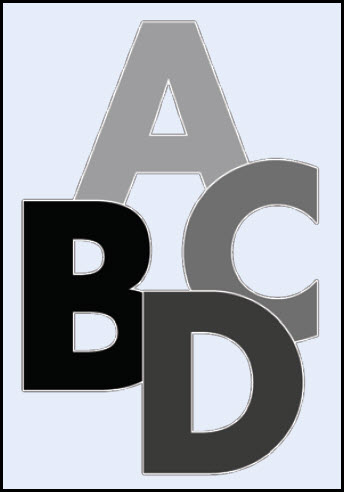
Ineffective – This message is ineffective because it has visual clutter. Visual and written information that overlap cause the reader to pause and sort the two apart before understanding the message. People can’t see and understand four messages at once.
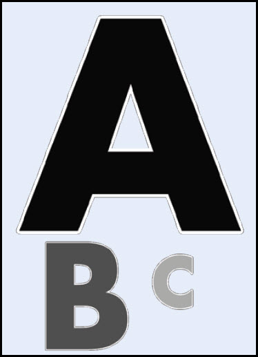
Effective – Visual priority makes this message effective. Using different levels as guidelines captures attention with a clear, single point of communication. Different levels also make the message flow more naturally, help speed comprehension and increase message retention.
Now that we’ve practiced, let’s create some real messages and show everyone what we’ve learned!
Example Message 1:
Ineffective – This message is ineffective because it has too many elements, too many different colors and too much information. The elements overlap each other and the text doesn’t flow naturally because it’s all the same size.
Effective – This message is effective because it has fewer elements and the most important element is big and bright. The text is large, uses all the available space and the graphic supports our message.

Example Message 2:
Ineffective – This message is ineffective because too many design elements compete for visual importance. Element placement is poor and does not encourage the eye’s natural flow. The important elements are buried in the text and too small to stand out from the rest of the message.
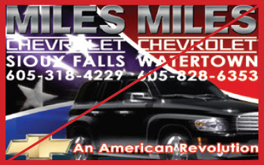
Effective – This message is effective because the placement of the most important element moves the eye naturally to the information. Fewer design elements help clarify the message. All the text is large enough so that it is legible and can be read and understood easily.

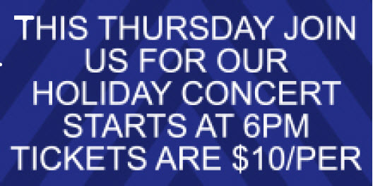
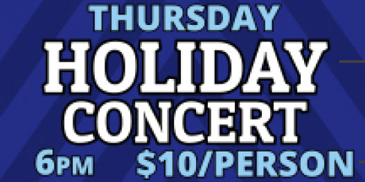
Example Message 3:
Ineffective – This message is ineffective because it is text-heavy which makes it hard to read and visually unappealing. Also, the font is too thin making it hard to read on the display from a distance.
Effective – This message is effective because it focuses on the main idea. Also, it uses bold fonts and has good contrast making it legible from longer distances.
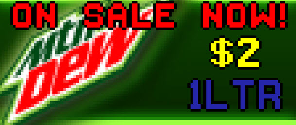
Example Message 4:
Ineffective – This message is ineffective because of too many elements and too much information. Passersby won’t have enough time to read all the information, so they will probably just end up ignoring the message altogether.

Effective – This message is effective because it is BRIEF, BOLD and LEGIBLE! All the text fits clearly in the message and is large enough for people to read easily. The text acts as a guide and leads people to the picture. It also directs people to take action by visiting us tonight.

Some people try to get all their information on one frame or piece of artwork. So, they add every possible detail they can think of. This mindset derives from traditional print advertising.
We recommend adding additional slides/layouts to your presentation if you absolutely need to include more information. That way those slides will play back-to-back and people will be more apt to pay attention to the additional ads if the first one follows our rules!
We also recommend taking a look at an award-winning document, put together by our Creative Services team, with easy-to-understand instructions and examples for turning print media into digital media!
We hope that this information helps you create the most effective content ever! Be sure to keep an eye out for the next blog in our series focusing on the Best Practices of Content Creation. If you enjoy reading our blog and find it helpful, please click on the orange “Receive Email Updates” button on the right side of the page to subscribe.
Thanks for reading!