Best Practices Breakdown: Color Contrast
This week marks the final chapter in our series about content creation best practices. Today, we will discuss color contrast, why it’s important, and how to apply to make the best-possible-looking messages for your display.
Daktronics Commercial Software Training on 10/26/2017
Categories: Venus Control Suite Training
This week marks the final chapter in our series about content creation best practices. Today, we will discuss color contrast, why it’s important, and how to apply to make the best-possible-looking messages for your display.
If you haven’t read the first two chapters in our series, click the links below!
Contrast Defined
So, what is contrast exactly? It is the state of being strikingly different (in color or brightness) from something else, typically something in juxtaposition or close proximity. In terms of the color on your LED display, this means a noticeable difference between your text, outlines and the background of your message.
Contrast between colors is key! To make it simple, contrast refers to the difference between light and dark.
You see, if any of those elements have the same color or very similar colors, it will make your message very difficult, if not impossible, to read. When contrast is low between text and background, the message blends together, reducing legibility of the display.
Therefore, using high contrast is vital to your design because it helps the viewer distinguish between design elements.
Contrast Applied
You might be asking yourself right now, “Well, what colors am I supposed to use, then?” I completely understand where you’re coming from, but try not to overthink it. It’s as easy as using a Color Wheel to find complimentary colors.

One way that I often think of contrast is in terms of the colors and logos of my favorite sports teams! Almost all sports teams have excellent color contrast in their logos. So this should give you some ideas when it comes to creating content and where to start with choosing colors.
Daktronics is in Brookings, SD, which is also home to the South Dakota State University Jackrabbits! Take a look at the logo below to see an excellent example of color contrast using blue and yellow.

Based on what we’ve talked about so far, you want to select colors that provide good contrast to make your content more appealing and easier to read. Achieve effective contrast by using colors with different values.
Grayscale
For best contrast, use tonal contrast, or value difference, instead of only color difference.
Measure tonal contrast by using compositing software, such as Adobe® Photoshop®. Simply open your advertisement using your preferred compositing software and then convert it to grayscale. You can now easily measure the advertisement’s tonal contrast. An example of this is shown below, right.

You might be asking yourself, what does grayscale have to do with me?
Well, it can be used to confirm whether or not your message has good contrast! Grayscale images are unique in that they vary from black at the weakest color intensity, to white at the strongest color intensity. Grayscale is an image that shows only intensity information and is composed entirely of shades of gray. And no, we aren’t talking about those novels!
So, by comparing the shades of gray in your images to one another, you can tell if your message will stand out from the background or not.
Testing Grayscale
You don’t have to have a fancy program like Adobe Photoshop installed. In fact, you can use Content Studio to create and save Scrolling Text messages as individual images that can be used to test how different colors compare to each other in grayscale. This will give you an excellent idea of which colors have the best contrast.
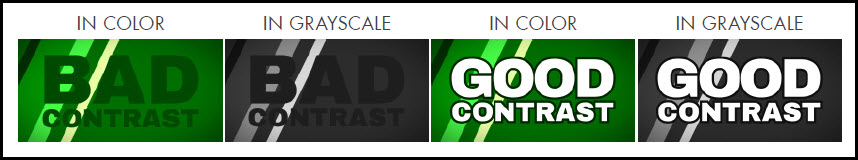
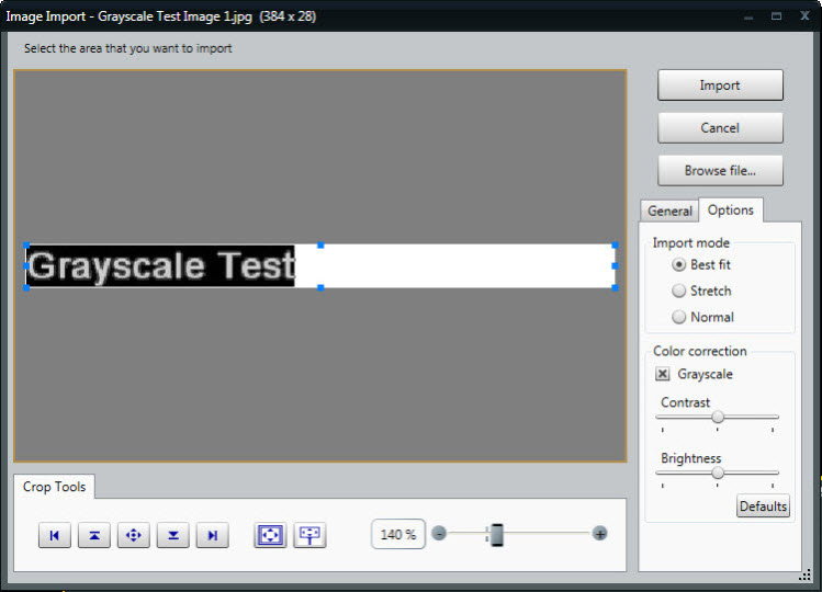
Take a look at the images below. The first image is a picture from the Daktronics media kit in the import window.The second picture is the same image, but with grayscale selected in the Options tab.This allows us to see that the text does stand out from the background, so we know that we have good contrast!


Obviously, that was a picture from the Daktronics media library, so of course it’s going to have good contrast.
Let’s take a look at how we can use Content Studio to create a scrolling text message that you can use to test contrast.
All you have to do is click on the Floppy Disc icon to Save Text as Image before you import the scrolling text into your layout.
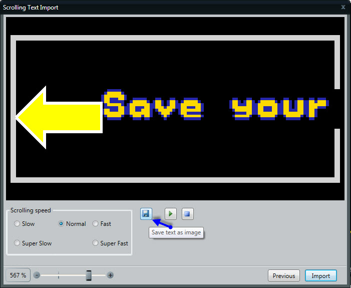
Then choose a place to save (your desktop, for example), and now you have a PNG file of your Scrolling Text to look at! Just double-click the file from your desktop (or wherever you saved it) to open and review.
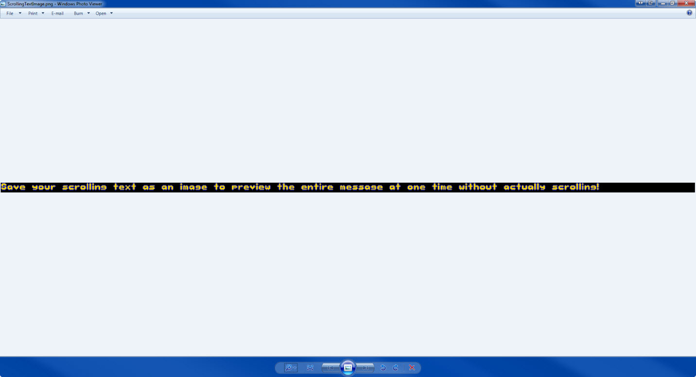
Once you have your scrolling text message saved as an image, you can import it into content studio as an image. And since the image import window has grayscale, you can check and confirm if your message has good contrast.
This may sound intimidating or like a lot of work, but it honestly took me longer to explain it than it’s going to take you to actually do it!
Keeping in mind what you’ve learned so far, let’s begin our contrast test!
- Create a scrolling text message with the background color, font color, size, and type you want your new message to have.
- Save the scrolling text message to your desktop.
- Browse to the scrolling text message and double-click to get it into the Image Import window.
- Click on the Options tab and put a check mark next to Grayscale.

Does your text clearly stand out from the background, or is it blurred together in similar shades of gray? If it stands out, you have good contrast and can create your message! If it blurs together, you know your message doesn’t have good color contrast, so you shouldn’t use it. It’s that simple!
Types of Contrast
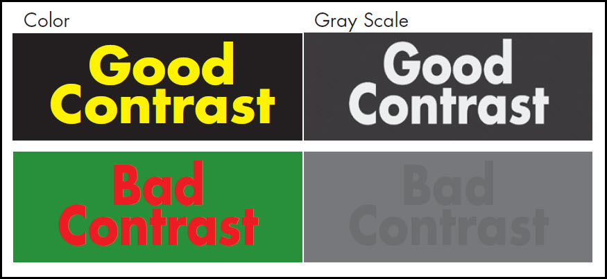
Now that we know how to use grayscale, we can talk more about using tonal (value- based) contrast to compare good contrast to bad contrast. You can achieve effective contrast by using colors with different values (how bright or dark a color is).
Use the chart below to guide your design. You can see that yellow is a bright color with a very light-gray value. Purple, on the other hand, is a dark color with a black value. Therefore, using yellow and purple together provides very good contrast.
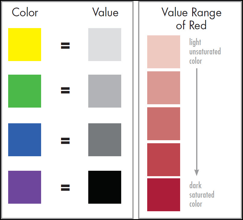
By looking at the chart again, you can see that yellow and green aren’t the best colors to use together because the contrast between the two is so low. Solve this problem by using a darker green that has a darker value to increase contrast and readability.
The value range chart above shows you how each color (in this example we used red) has a number of values to choose from. This makes contrast easy to achieve.

Speaking of Colors . . .
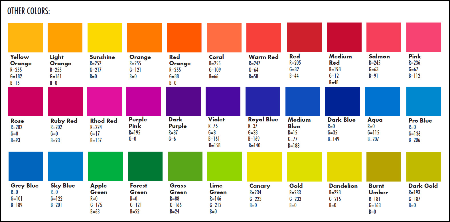
These colors are standard in Venus Control Suite. Use these colors for text as recommended. You may find other colors that work well.

Find information below about the RGB (red, green and blue) colors that look the best on a digital display.

Choose these colors when building digital content/artwork/advertisements to take advantage of the full-color capabilities of your cutting-edge Daktronics digital billboard.
What to Avoid
I know at this point we probably sound like a broken record, but when using colors on your display we recommend rich, vibrant, saturated colors. Try to stay away from white and pastel colors.
A good tip to follow when choosing colors for your message is to use a dark background. And avoid white backgrounds. They may look appealing in other advertising media, but for a light-emitting display, the harshness can repel the customer’s eye.

With LED technology, the use of emitted light, white or very light colors may repel the eye—not the desired response in advertising. A grave concern in most regulatory environments is offensive use of light or white content. Even though Daktronics digital displays are fully capable of producing white and pastel colors, it is not recommended.
Taking advantage of the color capabilities is thoughtful and in general more pleasing to the eye. If white or pastels must be used, the content should only be scheduled for daytime viewing.
For digital billboards, black is the absence of color. Black is created with the use of less light. White blends all colors and uses more light in digital billboards.

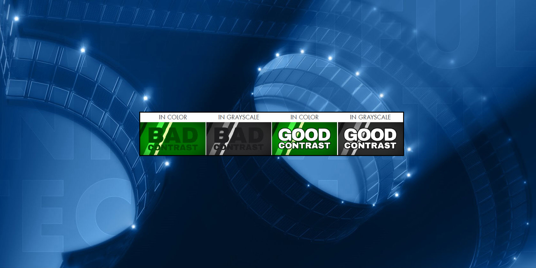
You also want to avoid color vibration. Color vibration is when the edges of two colors appear to merge and blur, giving the illusion of motion.
The bottom image uses hues of red and green that have the same tonal value (bad contrast). It is difficult to distinguish between background and text. This produces an effect called “vibrating.” After converting content to gray scale, the advertisement’s tonal contrast is apparent.
Below are some additional examples of good contrasting color combinations compared to vibrating color combinations:

This concludes our series on the best practices of content creation. We hope you find it helpful in all of your creative ventures! Be sure to click on the orange “Receive Email Updates” button on the right side of the screen to subscribe.
Thanks for reading!