Brightness Levels & Background Colors
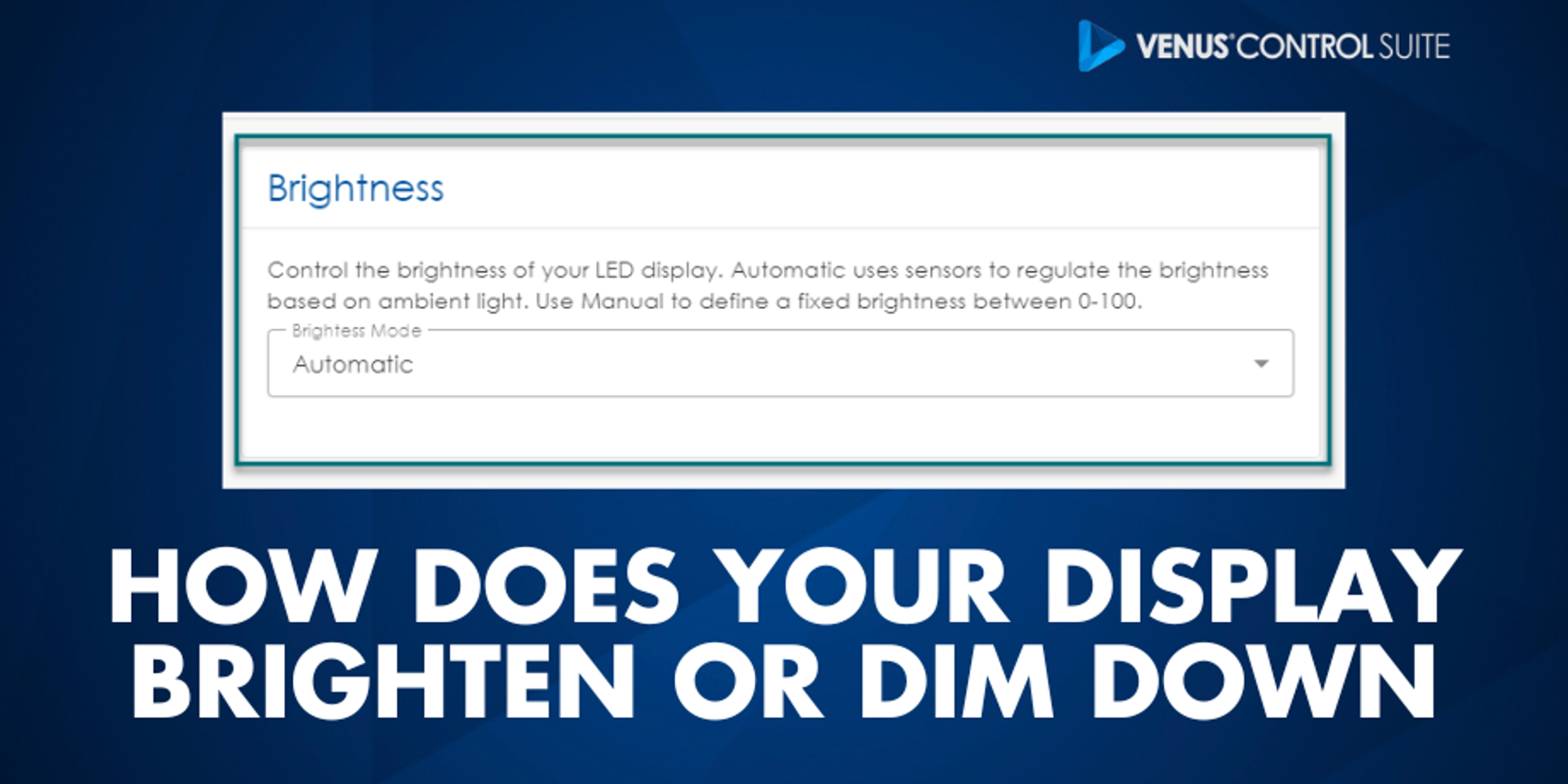
Did you know that you have a photo sensor in your display that automatically adjusts the brightness levels of all the LEDs, depending on how bright or dark it is outside? This means that your display should always have the ideal amount of brightness no matter what time of day it is.
Daktronics Commercial Software Training on 9/29/2016
Categories: Venus Control Suite Training
Industry brightness standards
Sometimes neighbors or other passersby in residential areas have a different opinion, though. They might say it’s so bright and it keeps them up at night, or that it’s too dim to even read.
If anyone ever says anything like that to you, then the first thing you should do is read a blog from our Sign Company News team here at Daktronics titled Free ISA Resource: Brightness Levels for LED Signs.
It provides an up-to-date brochure on current accepted brightness levels for LED displays in the industry, as well as contact information for our Daktronics legislation team, who can answer any questions you might have.
What if Your Display is Too Bright? Or Too Dim?
Now, if you actually do notice that your display is too bright, or the content on your display doesn’t look the way it used to, or the way it looked when you created/imported it, that is another story. I have talked to people who say their messages are way too bright, and other people who say they are too dim.
Most of these people at one time or another went into the brightness settings in their display software and tried to manually change it. We do not recommend doing this. Remember, your display has a photo sensor that takes care of that for you.
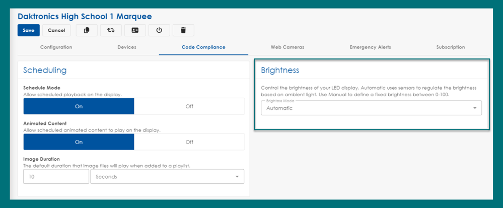
Don’t change brightness settings
Just because you can change the settings doesn’t mean you should. A lot of times the brightness settings have nothing to do with the actual problem, but if they are adjusted it can make it more difficult for us to troubleshoot and diagnose the real cause of what is happening.
If your display is ever too bright or too dim, please call Daktronics Support at 1-800-DAKTRONICS (1-800-325-8766).
Check your content
Sometimes, even the content we create can make our display look too bright. When using colors on your display, it is best to use rich, vibrant, saturated colors. Try to stay away from white and pastel colors. A good general tip to follow when choosing colors for your message is to use a dark background and avoid using white backgrounds.
White backgrounds may look appealing in other advertising media, but for a LED display, the harshness can actually repel people’s eyes. The overwhelming brightness of white backgrounds can even drown out the rest of your message, making it unreadable.
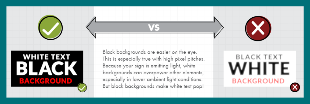
Instead, use dark colored backgrounds! When using a colored background, you should outline the text in black for the greatest readability. If your font isn’t too small, then try a 2-pixel outline to really make your text stand out!
Trainer Tip: Avoid using red and white together in the same message. When those two colors are side-by-side they can actually make it look like the message is vibrating. The colors will also “bleed” into each other and end up looking pink. Kind of like if you threw a red shirt into your white laundry pile! If you absolutely have to use red and white, then be sure to separate them by putting a thick black outline around your text.
Automatic brightness mode is a lifesaver when it comes to your display appropriately displaying content. If you have brightness level issues let us know! Otherwise, don't forget you can connect with other users in our Facebook group and subscribe to our blog for the latest updates!